End to end design of Sinpe School
Design principles
End-to-End UX/UI Design for an E-learning Platform

Sinpe School is an e-learning platform focused on photography education. In this project, I led the end-to-end product design process, from early product strategy to final implementation and post-launch iteration.
My approach combined User-Centered Design, Design Thinking, and Lean UX principles, ensuring that decisions were grounded in both user needs and real-world constraints.
1. Product Strategy & Discovery
I started the project with a Product Discovery phase, aligning business objectives with user needs.
Key activities included:
Defining business goals (e.g., improving conversion and engagement)
Identifying user needs and expectations
Analyzing gaps between the current experience and the desired one
This phase established a clear product direction and informed all subsequent design decisions.
2. User Flow & Experience Design
With a clear understanding of the problem space, I redesigned the user flow to reflect improvements in the service.
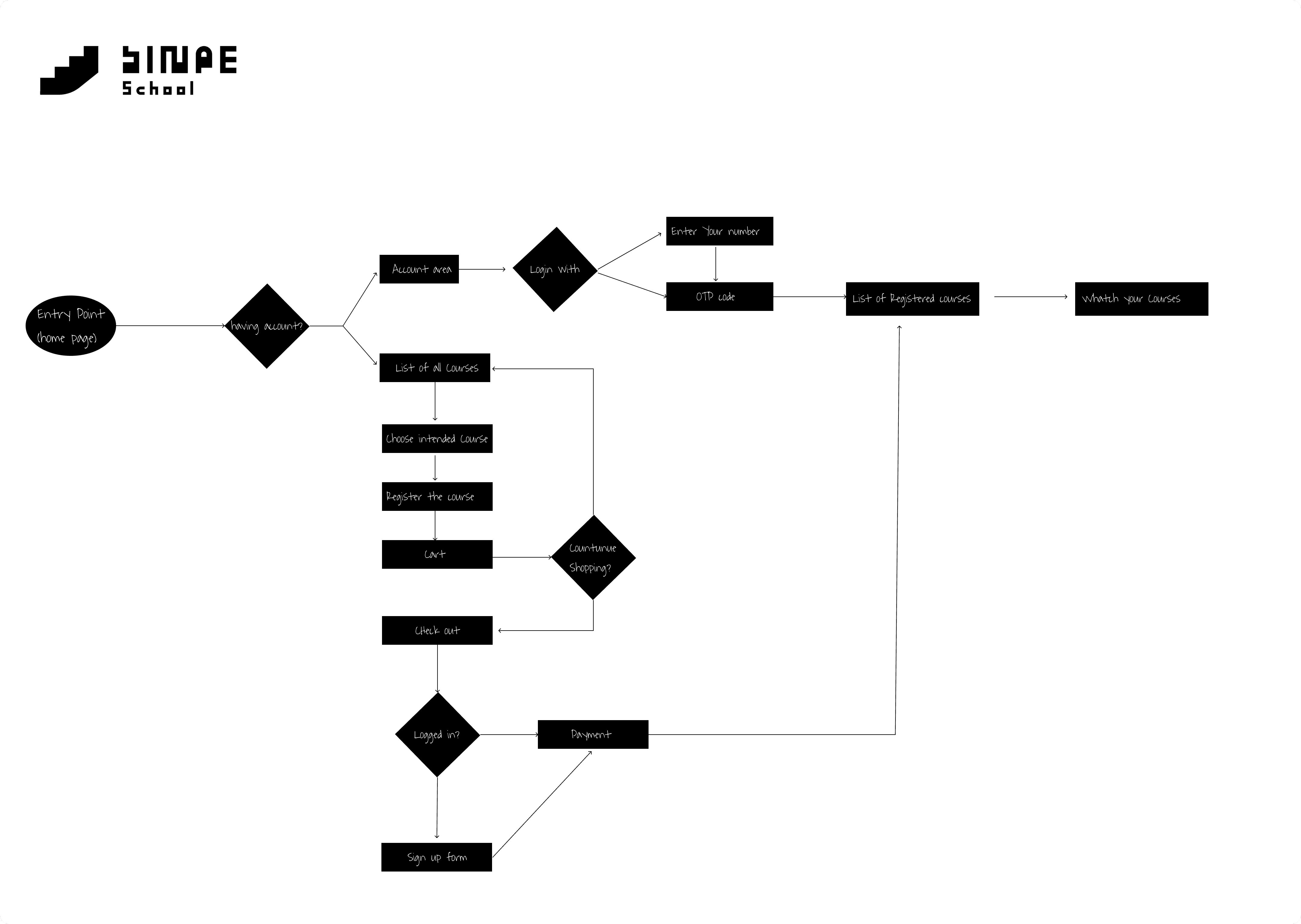
In this stage:
I mapped key task flows (e.g., browsing courses, enrolling, learning)
Identified and reduced friction points
Optimized the experience through Interaction Design (IxD) principles
The goal was to create a seamless path for users to achieve their primary goals with minimal effort.
3. Information Architecture
To support a content-heavy learning platform, I designed a clear Information Architecture (IA).
This included:
Structuring course categories and content hierarchy
Designing intuitive navigation
Aligning the structure with users’ mental models
A well-defined IA ensured that users could easily find and navigate through educational content.
4. Mid-Fidelity Wireframing (Figma)
After defining the structure, I moved into Mid-Fidelity Wireframing using Figma.
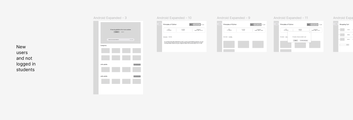
At this stage:
I focused on layout, hierarchy, and usability
Avoided visual distractions to validate structure early
Iterated quickly on different layout solutions
Design Decision Highlight:
To improve usability in content-heavy pages, I implemented a Supporting Pane layout pattern based on Material Design.
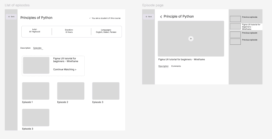
This pattern allowed:
Secondary information (e.g., navigation, metadata) to remain accessible
Better content organization without overwhelming the main view
A scalable and flexible layout system
5. High-Fidelity UI Design
Once the structure was validated, I translated the wireframes into High-Fidelity UI designs.
This phase included:
Applying the visual identity (externally developed)
Building a consistent UI system (typography, color, components)
Ensuring visual consistency and brand alignment
The result was a polished interface aligned with both usability and brand perception.
6. Design Handoff & CMS Implementation
After finalizing the design, I implemented the product using WordPress CMS. In addition, I had to transfer old users from old system we ha
Key aspects:
Translating design into a functional product (Design Handoff)
Adapting UI components to technical constraints of CMS
In addition, a critical part of this phase was user migration:
Transferring existing users from the legacy platform to the new system
Ensuring a seamless transition without disrupting their experience
Allowing users to retain access while benefiting from updated content
7. Post-Launch Feedback & Iteration
The design process continued after launch through real user feedback and iteration.
8. Results
The outcome of this process had a direct impact on both user experience and business performance:
Reduced friction caused by manual user registration
Enabled automated enrollment, allowing users to instantly access courses
Improved overall onboarding experience
As a result:
Users could start learning immediately after signup
The user growth rate increased significantly
This growth directly contributed to an increase in company revenue
By aligning design decisions with both user needs and technical execution, the product achieved measurable improvements in efficiency, scalability, and business success.